

Custom Blank Print Label Company: Expert Tips for Quality and Value
2026-05-29
In the bustling world of custom packaging, every detail counts. Choosing the right blank print label isn’t just about sticking a logo on a box—it’s about making a lasting impression. At Xinsen, we know that quality labels start with expert craftsmanship and smart material choices. Whether you’re launching a new product or refreshing your brand, the right label can elevate everything. So, what should you look for to get both top-notch quality and unbeatable value? Let’s peel back the layers and reveal the secrets that set exceptional labels apart.
Why Your Label Material Could Be Costing You More Than You Think
When labels start peeling after a few weeks or fade under normal lighting, the immediate reaction is to blame the printer. But the real drain on your wallet often begins with the substrate you chose. Inferior facestocks and adhesives don’t just fail—they trigger a cascade of hidden expenses: wasted product batches, emergency reordering at premium rates, and the labor hours spent manually reapplying or scraping off failed labels. Over a year, these seemingly minor incidents can quietly eat up 15–20% of your labeling budget, turning a “cost-saving” material into a recurring financial headache.
The impact goes beyond operational hiccups. A label that smudges, curls, or cracks on a retail shelf weakens your brand’s shelf presence, often leading shoppers to question the quality of the contents. In industrial or medical settings, label failure can trigger compliance violations, rejected shipments, or even safety risks—each carrying penalties far exceeding the pennies saved per label. The tricky part is that many of these problems only surface weeks or months after application, long after the initial purchase decision is forgotten, making it difficult to connect the dots back to the original material choice.
A smarter approach treats label material as a long-term investment rather than a commodity. Start by mapping out the full lifecycle conditions: Will the label face moisture, abrasion, extreme temperatures, or chemical exposure? Then work with suppliers who offer durability testing with your actual containers and environments, not just glossy spec sheets. Often, upgrading to a slightly higher-grade film or a more aggressive adhesive adds a fraction of a cent per label but eliminates cascading costs, preserves your brand reputation, and keeps your operations running without constant firefighting.
The Overlooked Print Technique That Delivers Premium Results
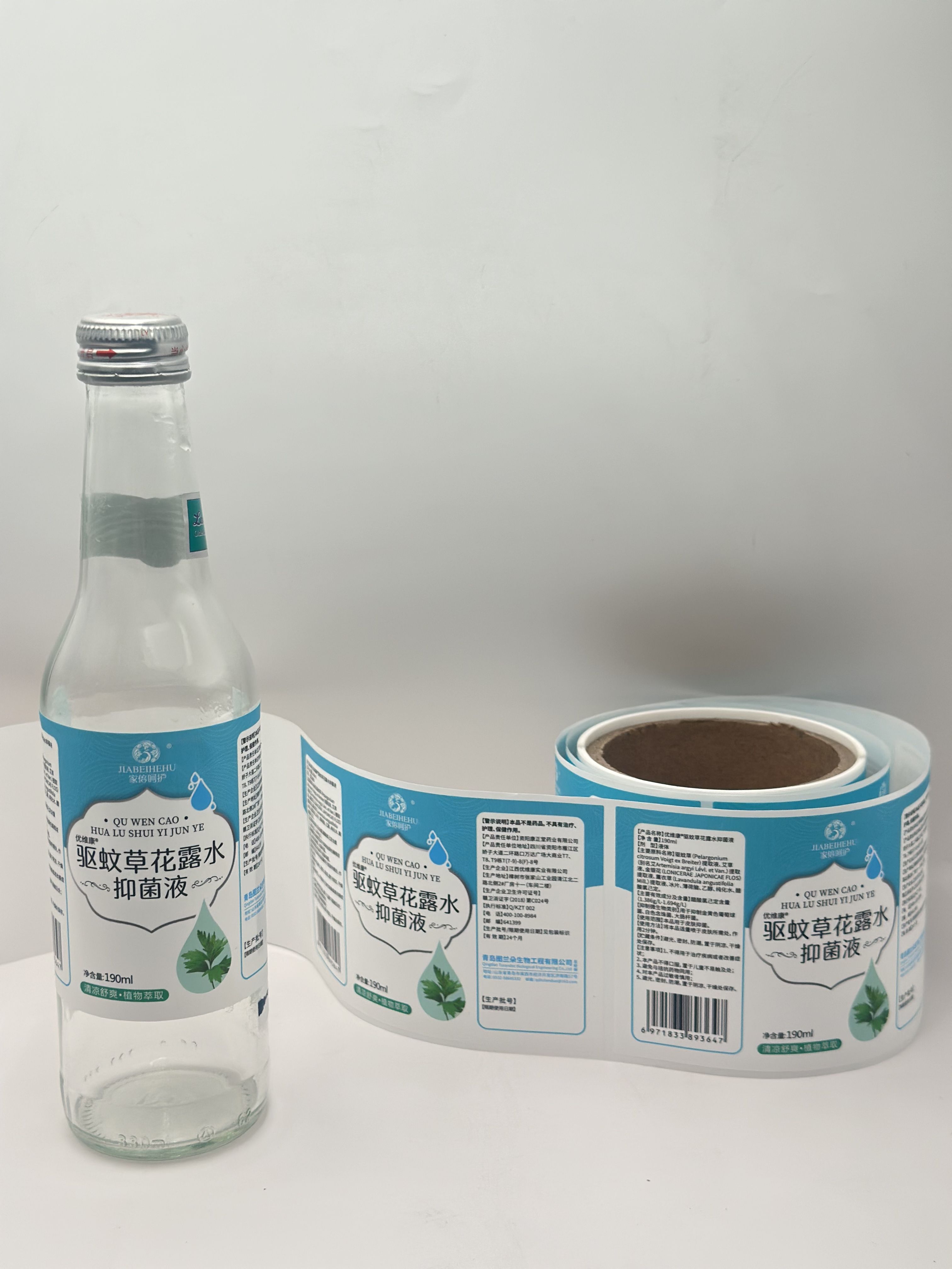
Most designers chase the latest digital effects, but letterpress remains a quiet powerhouse. This technique, born centuries ago, presses ink directly into soft, thick paper, leaving a subtle indentation you can feel. It was nearly abandoned when offset and digital prints took over, making it slower and less predictable. Yet that very unpredictability is what gives letterpress its soul—each impression is slightly unique, carrying the mark of human craft rather than machine uniformity.
The appeal lies in details that screens can’t replicate. Running your fingers over a letterpress business card, you feel the grooves of the type, a physical echo of the design. This tactile presence elevates even simple logos, transforming ordinary stationery into keepsakes. When paired with dense cotton stocks and deep inks, it conjures a sense of heritage and permanence that glossy digital output simply cannot match.
Smart brands are now turning to letterpress for small-batch runs of invitations, packaging, and limited editions, where the goal is to signal care and exclusivity. It demands patience—mixing inks by hand, locking type into the chase, pulling test prints—but the outcome is a piece that people instinctively want to hold and keep. In a world saturated with throwaway visuals, letterpress delivers a premium result by reminding us that what we can touch often matters more than what we merely see.
Shape and Size Hacks for Labels That Stand Out
Playing with proportions can instantly draw the eye. Instead of defaulting to neat little rectangles, try an oversized circular label on a square box—the contrast between the two shapes creates a visual tension that makes people pause. Even a subtle shift, like using a tall, skinny label on a short jar, can force a second glance. The key is to let the label shape clash or complement the container in a way that feels intentional, not accidental.
Size doesn’t just affect visibility—it changes the entire personality of your product. A tiny, centered label on a large bottle whispers minimalism and luxury, while a massive wrap-around label screams boldness and fun. Don’t be afraid to break the edges: a die-cut label that follows the contour of your logo or a quirky illustrated element can make the shape itself part of the story. It’s about using dimensions to hint at what’s inside before anyone reads a single word.
Consider the shelf context, too. If everything around you is horizontal and rectangular, a vertical diamond-shaped label immediately stands apart. The material matters as well—pair an unusual shape with a matte finish or a spot of foil, and you’ve got something that demands to be picked up. Ultimately, these aren’t just stickers; they’re silent salespeople, and their shape and size should be as persuasive as the copy on them.
Quality Control Secrets the Best Label Companies Won't Tell You
Most label companies talk a big game about quality, but behind the scenes, it’s often a different story. One of the biggest secrets is how they handle raw material inconsistencies. The best outfits don’t just trust their suppliers—they run their own incoming inspections on every roll of face stock, liner, and adhesive. They test for caliper variations, moisture content, and release force because even a subtle shift can cause die-cutting nightmares or liner tears on high-speed lines. If they don’t catch it early, you end up with labels that refuse to peel or split during application.
Another quiet practice is how they manage press conditions in real time. You might think digital controls handle everything, but the truth is, ambient temperature and humidity still wreak havoc on ink viscosity and web tension. Smart label converters use environmental loggers and adjust their anilox roll speeds and dryer temperatures throughout the day—something rarely mentioned in sales pitches. They also keep a “ghost file” of common trap errors: slight misregistrations that pass standard inspection but look off to a trained eye. These get tweaked during makeready, saving you from a batch that meets specs but fails your brand’s aesthetic.
Then there’s the hidden cost of “acceptable” waste. Most shops calculate scrap rates after the fact, but the ones worth their salt track it live by roll and operator. They know that a spike in matrix breaks or splice waste isn’t just a number—it’s a signal that a die is dulling or a tension setting needs rebalancing. And here’s a trick they won’t volunteer: they often run a “kitchen test” on finished labels before shipping, sticking samples to the exact carton or bottle material you’ll use, then subjecting them to your actual distribution conditions—freezer cycling, vibration tables, even a stint in a sun-soaked window. If your supplier isn’t doing that, you’re gambling on performance.
Smart Ordering Strategies to Maximize Your Budget
Getting the most out of your spending starts with understanding your actual consumption patterns. Take a few minutes each week to review what you’ve ordered, what went to waste, and why. This simple habit can reveal surprising insights—like that extra-large pack of perishables you never finish or the mid-week slowdown that makes bulk buying less sensible than it seems. By aligning your orders with real demand instead of guesswork, you’ll trim excess without sacrificing quality.
Next, rethink how you group your purchases. Many people overlook the power of consolidation: combining different items from a single source often unlocks lower per-unit costs, even if it means tweaking your usual supplier list. Don’t be afraid to mix high-turnover staples with occasional-use items in one order—the savings on shipping and bulk tiers can outweigh minor convenience shifts. It’s also worth exploring off-peak delivery slots or pickup windows, which sometimes come with reduced fees that add up over time.
Finally, treat your budget as a flexible guide rather than a rigid cap. Allocate a small “experiment” portion each month to test new items or alternative brands that might deliver better value per serve. Track the results for a few cycles, then adjust the mix. This iterative approach not only keeps your orders fresh but often uncovers hidden gems—products that deliver the same enjoyment at a fraction of the expected price. Over time, these adjustments compound into noticeable savings without feeling like you’re cutting back.
How to Spot a Print Partner That Actually Cares About Your Brand
A print partner that truly values your brand won’t treat you like just another job ticket. They’ll take the time to understand what your brand stands for—your story, your audience, and the message you want to convey through every printed piece. This isn’t about checking boxes; it’s about having real conversations where they ask questions that go beyond file specs. When someone shows genuine curiosity about your goals, you can feel the difference.
You’ll notice it in the small things: the way they handle color accuracy, the suggestions they make about paper stocks that actually complement your design, or the fact that they catch a typo you missed. A partner who cares will flag inconsistencies not because they’re being difficult, but because they want your final product to reflect the quality your brand deserves. They don’t cut corners to speed up production—they treat your project with the same attention to detail they’d give their own.
Communication is where it all really comes together. A reliable print partner keeps you in the loop without you having to chase them down. They’re upfront about timelines, honest about what’s achievable within your budget, and quick to offer solutions when something unexpected pops up. More than anything, you’ll feel heard—not like another client on a list, but like a collaborator they’re proud to work with. That kind of relationship doesn’t just happen; it’s built on trust and consistency, print job after print job.
FAQ
Focus on material durability, adhesive strength, and finish. Ask about coatings that resist moisture, UV, and abrasion if your labels face tough conditions. A reliable company will gladly share spec sheets and past client examples to back up their claims.
Timing and flexibility matter. Order during off-peak seasons if possible, and don't shy away from asking about overrun discounts or combined shipping for multiple SKUs. Clarify whether plate charges or setup fees are included upfront to avoid surprises.
Synthetic stocks like polypropylene or polyester with a UV-resistant laminate are your best bet. They hold up against sun, rain, and temperature swings far better than paper. Request a weathering test sample if you're unsure.
Absolutely. A reputable printer should offer material swatches or sample prints of your design. It's the only way to gauge color accuracy, adhesive feel, and overall look under real-world handling.
Insist on a color profile match from the first run and ask if they use automated color calibration during printing. Storing your approved swatches or digital proofs on file helps maintain consistency over time.
Vector files like PDF or AI are ideal for fine text and sharp edges. Always embed fonts and outline text to bypass font substitution issues. Provide a high-res raster proof alongside to verify placements.
Many sustainable materials today rival traditional ones. Look for FSC-certified face stocks, recycled content liners, or compostable adhesives. A good supplier will reveal the full supply chain so you know the environmental trade-offs.
Conclusion
Often, businesses overlook the hidden costs embedded in their label material choices. What seems like a bargain upfront can quickly turn into a recurring expense due to rapid wear, poor adhesion, or fading that damages brand perception. The real value lies in selecting substrates that align with your product's environment—whether it's moisture-resistant synthetics for bath products or durable vinyl for outdoor equipment. Similarly, printing techniques aren't one-size-fits-all. While digital printing dominates for short runs, flexography can deliver sharper details and better color consistency at scale, often at a lower per-unit cost. Even the label's silhouette matters: an unconventional shape or a precise die-cut can command attention on crowded shelves, while optimizing dimensions reduces material waste without sacrificing impact.
Behind the scenes, rigorous quality control is what separates a reliable supplier from a costly mistake. The best partners run inline inspection systems and color calibration checks without being asked, ensuring every batch mirrors your approved sample. Smart ordering involves more than just bulk discounts; it's about timing reorders based on actual fill rates and warehousing agreements that trim overhead. When vetting a print company, look beyond the quote. A genuine collaborator will question your usage scenarios, suggest alternative stocks that preserve quality without inflating costs, and proactively flag production issues. They treat your brand's integrity as their own, because when your label fails, it's their reputation on the line too. The right partnership transforms a simple blank label into a strategic asset that protects your product and amplifies its worth.
Contact Us
Contact Person: Yara
Email: [email protected]
Tel/WhatsApp: +86 13505426090
Website: https://www.qdxspack.com/